I’ll be the first to admit it: I love a good e-book. One that provides great content — actionable stuff, not fluff — and a clean, easy to follow design is hard to resist. E-books are super popular right now, and for good reason. They make great opt-in incentives or lead magnets, you don’t have to worry about printing anything physical, you can send it directly to your customer with one click, and you can share just about any kind of information using an e-book format. E-books are great as freebies, but also make great digital products for sale in a shop, or included with an online course. They’re super versatile, they can be super valuable, but there’s also some bad news… they can be super ugly.
Yep, I said it. There are a lot of ugly e-books in the world, and frankly it makes me sad. I know the author put hours and hours into that content, and the outside just doesn’t show it. If you put that much work into creating an e-book that you feel is valuable and worth something to your audience, wouldn’t you want to make the outside look irresistible? I know I do. Today I’m going to share some tips for designing a well-rounded e-book, so your outside looks professional and inviting, and your reader can’t wait to crack it open.
Design tips for a functional + attractive layout to make your e-book irresistible.
1. Use the right software.
You may have seen this one coming :) Being a professional designer, I have to plug professional design software, but I also know some people don’t have access to or knowledge of those programs. “Those programs” would include the Adobe programs included with Creative Cloud – mainly InDesign. So what is InDesign? In short, it's used for anything with a lot of text and a lot of pages (read: e-books!). It’s a pretty massive program, but if you plan to design a lot of e-books or other PDF documents, especially to sell, InDesign is by far the way to go. If you need some extra help learning the ropes of it, I've got two ways for you to become a pro fast. Keep reading to find out more about my mini-class, How to Design the Perfect Ebook, and my full online course, The InDesign Field Guide.

While not everyone wants to go the InDesign route, some other options could include Canva, Apple Pages, or even Microsoft Word. BUT. Be cautioned that these programs are limiting and if you overuse certain features of them, your e-book will look unprofessional very quickly. It’s best when using programs like these to keep the design fairly simple and clean. Less is more :) Another thing I have to mention — please, I beg of you, do not create an entire e-book in Photoshop. Photoshop is an amazing piece of software but laying out multiple pages of text in it was not at all what it was intended for.
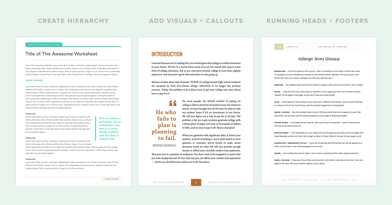
2. Create hierarchy with your text.
It’s very very very (one more very) important to keep your content organized as you’re writing your e-book, and keep that structure as you’re designing your layout. Being consistent with the size, font, and styling of all of your text will help create hierarchy so your reader knows what information to consume first. Use a new style for all the body text, the main headers, sub-headers, callouts, etc. Make sure you’re keeping the text styling clear and consistent so your reader doesn’t get confused. If they’re having trouble deciphering what’s what, you’ll lose their attention fast. Keep it all straight, so they don’t have to. In InDesign you can set up character and paragraph styles for every style of text you need, then you can go through your entire e-book and style each type of text with literally one click. Styles help you create hierarchy within your text and takes the guesswork out of formatting your text.
3. Add visuals, even just with text.
E-books obviously have a lot of text in them, so give your readers a break every once in awhile by breaking it up with images and visuals. Even if you don’t have photos to add, try incorporating some icons, illustrations, or even pulling some quotes from your text and enlarging them as a callout or sidebar. Places where you write out lists or data, try displaying it in a creative way so you break up paragraphs of text. It keeps your reader engaged and allows you to draw attention to important pieces of information you want your reader to remember. If you’re using InDesign, you can easily link up files from Photoshop or Illustrator to include graphics created in other programs, so everything holds it’s quality and your file doesn’t get too large to manage.

4. Include running heads or footers on every single page.
If you’re not sure what a running head is, it’s the small text along the top or bottom of a page that usually includes a combination of the following: page number, name of the e-book, and/or author name. It’s also important to include your website and a copyright line somewhere on every page – a footer works great for this. Why are these things important? Let’s say your reader wants to print out just a portion of your e-book as a reference or if you include printable pages like worksheets — if a single page is going to be printed out, you want your reader to remember where it came from. Running heads and footers act as a label for this so it’s always clear where this information came from. By using master pages in InDesign, you can create one template for this so you don’t have to copy / paste this information on every single page. Using master pages will streamline your entire design process and keep every page of your e-book consistent and professional.
5. Give it some white space.
This is a biggie. I see SO many poorly designed e-books that are jam packed with info from edge to edge on every page. It’s overwhelming and impossible to follow, and makes me want to quit reading it. Don’t do that to your audience! You’re not printing it, so why not spread out the information a bit, right? Give it some breathing room by leaving plenty of white space and margins. If a page is starting to feel crowded, overflow it to another page. This will help your entire e-book flow better and not feel so overwhelming. In InDesign, it’s easy to add in more pages and set up consistent margins to keep your pages having plenty of white space.
6. Mix up your content.
Like I said before, e-books are just that – books :) They have lots of paragraphs (if you’re doing it right!), so another way to break up the monotony is to add in some interactive pages like worksheets, checklists, charts, or case studies. Adding in entire pages that have a varied layout and a different type of content can be a nice break for your reader. Get creative with the type of value you’re providing with your e-book. Think about the types of e-books YOU like to read. How did they vary the content to keep you interested? How did they display that content to break up their usual pages? Experiment with some new formatting for these pages, but again, keep it simple and coordinating with the rest of your content. Don’t get too crazy or it can turn gimmicky :)
7. Include a call to action.
E-books are fantastic starting points for new customers. If you play your cards right, you can guide them to the next step you want them to take after they finish reading your e-book. Make that next step super easy and super obvious for them. If your e-book is a lead magnet for a larger program, include an entire page at the very end of your e-book giving them actionable steps to enroll in your program. If you’re wanting them to book you for a service, make that abundantly clear with sales info on the last page of your e-book. These days, you can’t assume the reader will know what you want them to do next. Give them a little push by including some actionable steps for them to take once they finish your amazing e-book.

To wrap up, e-books and PDFs are all the rage, but they have to be designed thoughtfully if you want them to be effective. Of course you can outsource your ebook/PDF design if you don’t want to be making these types of decisions, but if you’re going the DIY route, I highly recommend implementing all of these tips as you start designing the layout of your ebook/PDF. The design shouldn’t be an afterthought — it's actually super important. It can make or break all that hard work you’ve spent writing it. Make the outside match the inside, and design your ebook/PDF to be professional and irresistible.
Need some help designing your ebook?
Like I mentioned before, The InDesign Field Guide is my online course that teaches you everything you need to know to become an InDesign wizard, and design just about anything you need for your business or clients. Buuuut, if you'd rather focus on PDF design (and learn how to do it in under 2 hours, thanks to InDesign tutorials and a hefty template), you're in luck because my latest mini-class was created for exactly that.

It's like a little tiny, baby course centered around this one topic, and it's called Design a PDF with Adobe InDesign. That's kinda what you're wanting to do, no?! Yes. You can read all the details with the link below + even grab your spot in it. Hey, you could be designing your ebook or PDF by this afternoon. Pretty cool, huh?

Download my free ebook starter guide
This guide will help you see the big picture as you start laying out your ebook, and can help you make some design decisions up front before you even crack open InDesign (or whatever program you’re using!). Drop in your name + email to download the free guide right now.
your turn
Are you working on an e-book for yourself or a client right now? What parts of the design process do you find most difficult?


