
Choosing and pairing fonts or typefaces tends to be a struggle for many new designers. It takes a lot of practice to start to notice what goes together and what doesn’t and why. But lucky for you, I’ve got a quick primer that will help you do just that. Today’s post is all about how to choose, pair, and apply typefaces for your design projects for your own business or for client work. These are some great principles that can be applied to whatever program you’re using, and will help you take your projects (no matter how big or small) to the next level. Plus, stick around till the end for a great opportunity for you to learn even more about designing layouts + working with type. Let’s get started...
How to pair typefaces
Choosing the right typefaces can make or break your design. If you choose a combination that muddles the information you’re displaying, doesn’t fit with the style of your overall design, or is difficult to read, your viewer may be immediately turned off and it could devalue your work. It’s vital as a designer to know what kinds of typefaces look good together, and what kinds just don’t work. To learn this, it takes lots of practice, and lots of trial and error. Here are some basic rules to follow as you start pairing up typefaces.
1. Contrast
When displaying two different typefaces together, it’s super important to make sure they stand out from each other. Making sure there is enough contrast between the two typefaces creates hierarchy and helps your reader navigate through your text. If you choose typefaces that are too similar, it could get tricky trying to tell the difference between the two, and could become distracting.

2. Compliment
Perhaps the most important rule to follow when pairing typefaces, is making sure both typefaces actually look good together. Make sure the aesthetic of the two work together cohesively and don’t compete with each other. If your pair lacks this basic principle, it could come off as amateur and confusing. When thinking of the aesthetic and characteristics of your two typefaces, consider things like casual vs. elegant, rough vs. fluid, playful vs. professional, etc.
3. Characters + Uses
The last basic principle has to do with the characters themselves. Take a look at all the letterforms, numbers, symbols, and punctuation marks included with your chosen typefaces. Some typefaces only come with all uppercase letters, or some have all letters, but no numbers or symbols. Make sure you have everything you need from your typeface before your start your project, so you don’t run into any snags later on. Also pay attention to whether your typeface is intended for print use or for web use. Only certain ones can be used for text on-screen, so if you know you’ll be taking your design to that medium, I would suggest choosing from a library like Google Web Fonts or Adobe TypeKit.
How to apply typefaces to blocks of text
First things first, I would suggest using no more than 2-3 typefaces in a single design project. This of course depends on the type of project you’re designing, but most of the time, more than 3 typefaces gets cluttered, difficult to read, and frankly looks unprofessional. Design with these two overused, but completely true cliches: keep it simple, and less is more. When you’re applying typefaces to your design, you’ll typically need them for two main purposes: headers and body.
Header text
Header text could include titles, subtitles, callouts, and other areas of text you want to draw attention to. Almost any typeface will work for a header, but make sure it is easy to read, and doesn’t have too many lines. Trying to read a full sentence of decorative text in an intricate typeface is a major turn off for your viewer. For simple 1-3 word headers or titles, a complicated font may work fine. But if your header is more than a few words, dial it back a little and choose a typeface that is unique, but still legible.
Body text
Body text is the main paragraph copy used in your design. This is where designers tend to miss the mark. Body copy is meant to be read, right? So make it as easy as possible for your reader to get that job done. Putting your body text in all caps is a huge no-no. Using even a slightly ornate typeface for paragraphs of text makes it impossible to follow along. Other things to consider to make your body copy easy to read: proper line height and character spacing, and high contrast between the background and the body of text. Don’t make your reader strain. Keep your body typeface simple and classic. This is not the place to get creative.
Below are some examples… the left side shows a great application of typefaces. The header is interesting but still easy to read – also not too long that it’s cumbersome to follow. The body text is very legible and appropriate line spacing for ultimate readability. The right side shows a bad example. The header font is a bit difficult to read, especially flowing onto multiple lines (if you know your headers will be long-winded, choose a simpler typeface). The body font is not meant for paragraphs of text and is very difficult to read. Plus, the all caps makes it even harder to follow. Can you tell the difference?

Let’s review: a good typeface pairing should have high contrast, be complimentary and not competing, and should provide you with all the characters and symbols you need. A header should be interesting but still legible, and body text should be the ultimate in readability. Don’t make your reader work to consume your content!
Downloading Typefaces
Where can you find great quality fonts and typefaces, you ask? Here are a few of my favorites:
Be careful using libraries like DaFont or 1001 Fonts— a lot of these typefaces only include minimal character options, and are not designed for high quality, professional use.
A quick note about paid vs. free fonts. There are a lot of great free options out there, and there are some beautifully designed paid options as well. If you fall in love with a paid typeface for your design project, do the right thing, and pay for it. Designers put literally hundreds of hours into creating a typeface, and it’s pretty amazing that free options even exist at all. Pay the designer for their work if they have a price tag displayed, and don’t rip them off. Ok, end of rant!
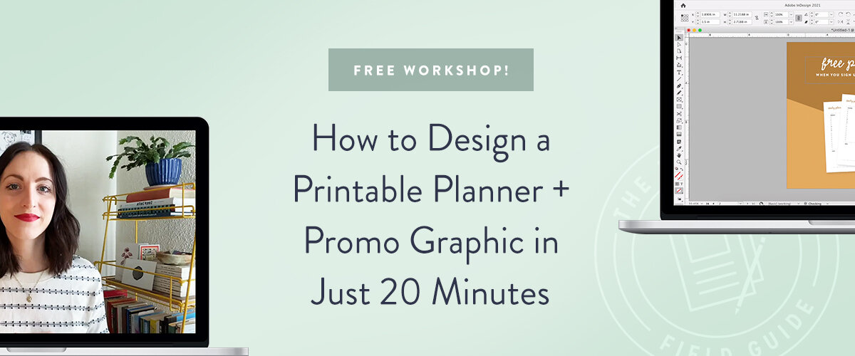
Want to learn how to use Adobe InDesign like a pro?

My FREE InDesign Cliff Notes is quick-start guide + video tour to get your feet wet with Adobe InDesign. Learn what InDesign is best used for, how it works, and how you can learn it FAST. I created this beginner’s InDesign guide with YOU in mind, and I think you'll see how not-scary InDesign really is. 😉Signup below, I’ll send you the full guide right now!
Your turn
Do you struggle with choosing and pairing up typefaces? What are your go-to combos? Are you as excited about The InDesign Field Guide as I am?! I may be a little bias ;)


